Create your Data Jam!
We have looked at a lot of numbers, but data does not have to look like graphs and charts. Watch the video below to learn more.
In this example we created a data jam with a mural to show the data trend in penguin populations.
First, print or draw the cut outs of the Adelie, Gentoo, and Chinstrap Penguins below to create a scale. Then color and decorate your penguins according to the scale you created.
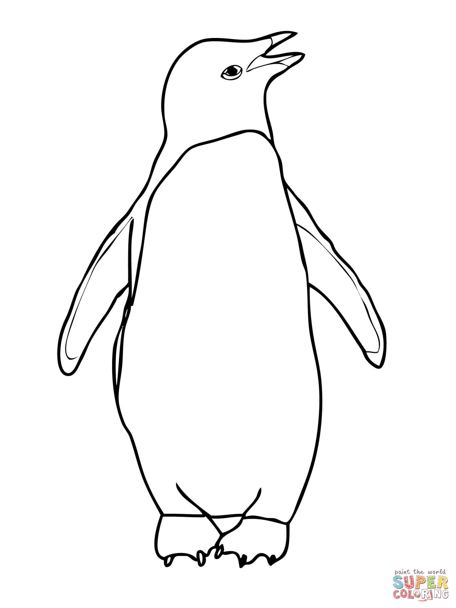
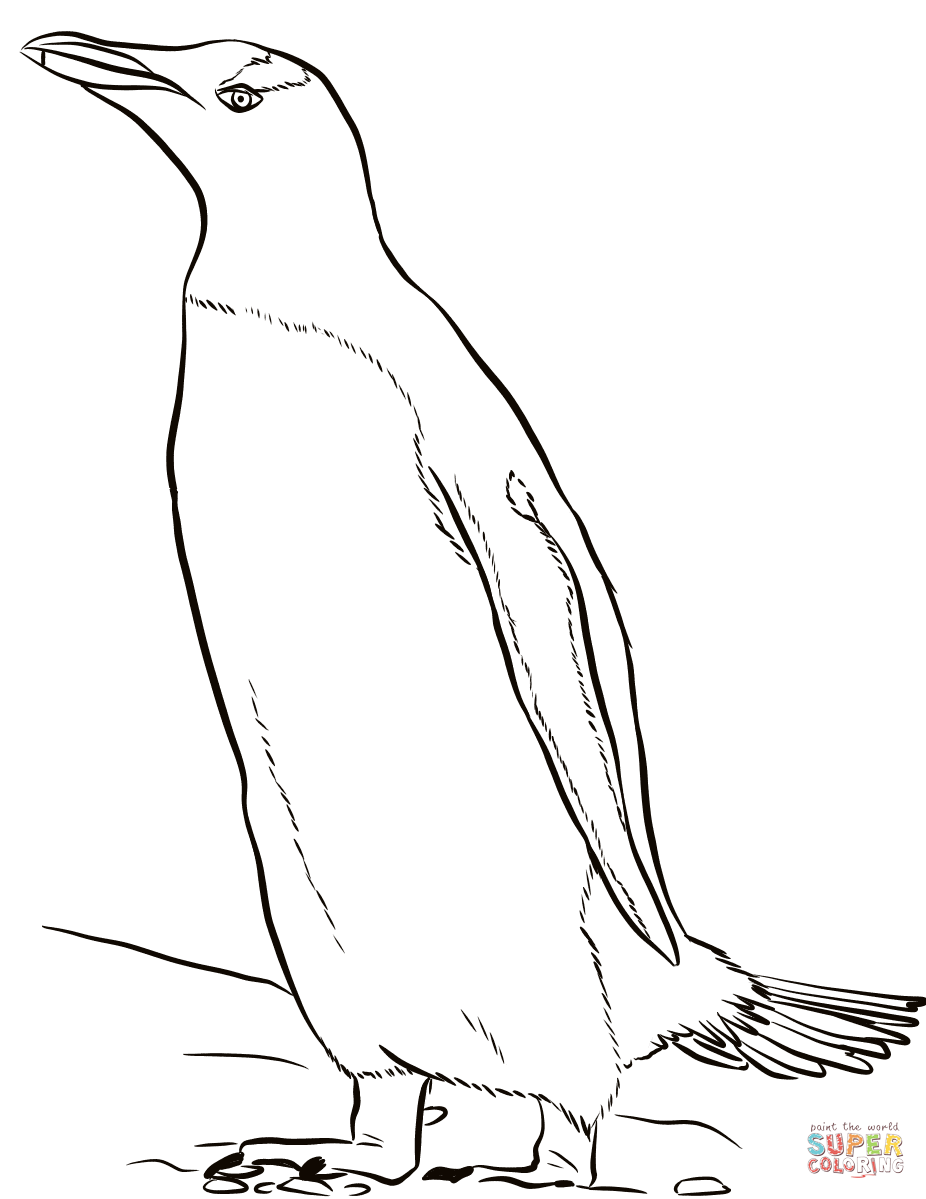

Next, paste the penguins on your mural based on the year and the scale you created. (We determined that 1 Penguin picture = 100 Breeding Pairs. If we went by this scale, for the 1995 section of your mural, you should have about 110 Adelie Penguin pictures. That’s a lot of penguins!)
Below is a sample mural youth created using the same penguin data for 4 different years:

After you have created your project, think about how you would explain your project to your friends and family:
- What is going on?
- What is this mural showing us?
- What would you ask the scientists if they were here looking at this mural?
- What other information do you wish you had?
Now its your turn!
Go back to your list of hobbies, interests, and skills. Think about which one(s) you want to showcase in your Data Jam. Use your talents to create your own unique project that uses ratios to represent the penguin population data.