Penguin Populations
In this activity, we will investigate a dataset that measured how the penguin population at one location changed over time.
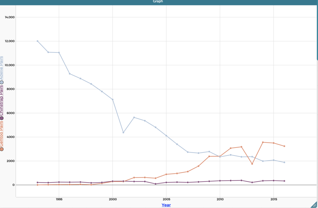
Specifically, we will view counts of penguin “breeding pairs” from 1979 to 2016 around Palmer Station in Antarctica.
To do this, we can use a tool called the Common Online Data Analysis Platform or (CODAP) for short. It is a free online tool that can be used to easily create graphs that visualize data. To get started, check out the buttons below.
Interact with the penguin dataset in the CODAP viewer.
Download a quick checklist version of the CODAP guide.
Download the full booklet version of the CODAP guide.
Once you create a graph using CODAP take a screen grab image of it and save it or print it for your research journal.
Now that you have created your own graph it is time to analyze it.
All three penguin species should be represented on the graph. Colors may vary but the trends should look like the graph below.
If your graph is different, try to start over and remake the graph.